


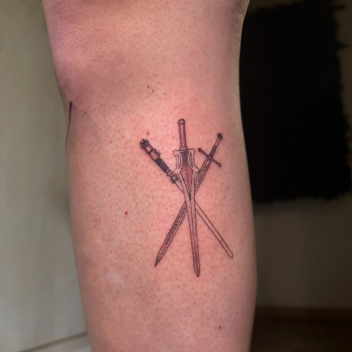
Lettering, illustration and floral shapes
Letter height, internal spaces and spacing matter in lettering. A long text needs more room than a single word. Small illustrations work better when their defining features stay clear; every additional line needs a purpose.
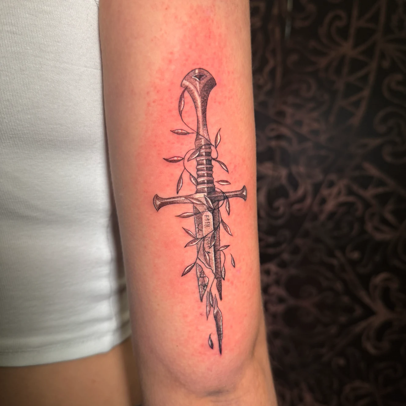
Floral designs can grow along an arm and include delicate shading. The sword motifs shown here combine a clear direction with smaller details. Space at the intersections and between the floral elements keeps the individual shapes readable.
As much space as the design needs
A design on a screen can be enlarged considerably. On skin, petals, letters and intersections must work at actual size. We check dimensions and detail spacing together. A simpler drawing or slightly more space may be more useful than squeezing every detail into a small area.
Placement and the direction of lines
Body curvature, movement and the preferred viewing angle affect placement. Hands and other areas exposed to frequent wear need careful consideration. Professional execution cannot be reduced to a general rule about needle pressure.
For repeating shapes or ornaments, compare geometric designs and ornamental linework. These also focus on how several lines work together across the body.
Think about long-term recognition
Fine tattoos change with the skin too. Size, execution and aftercare affect how distinct the details remain; unchanged lines cannot be guaranteed. Read more about tattoo colours and longevity and tattoo aftercare.
Read more about line weight and long-term readability in the guide to linework and fine line tattoos.
Find the right size for your fine line design
Send the exact lettering or motif idea, preferred placement and desired size. Explain which details matter most in your references.
